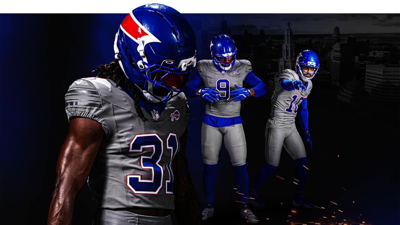
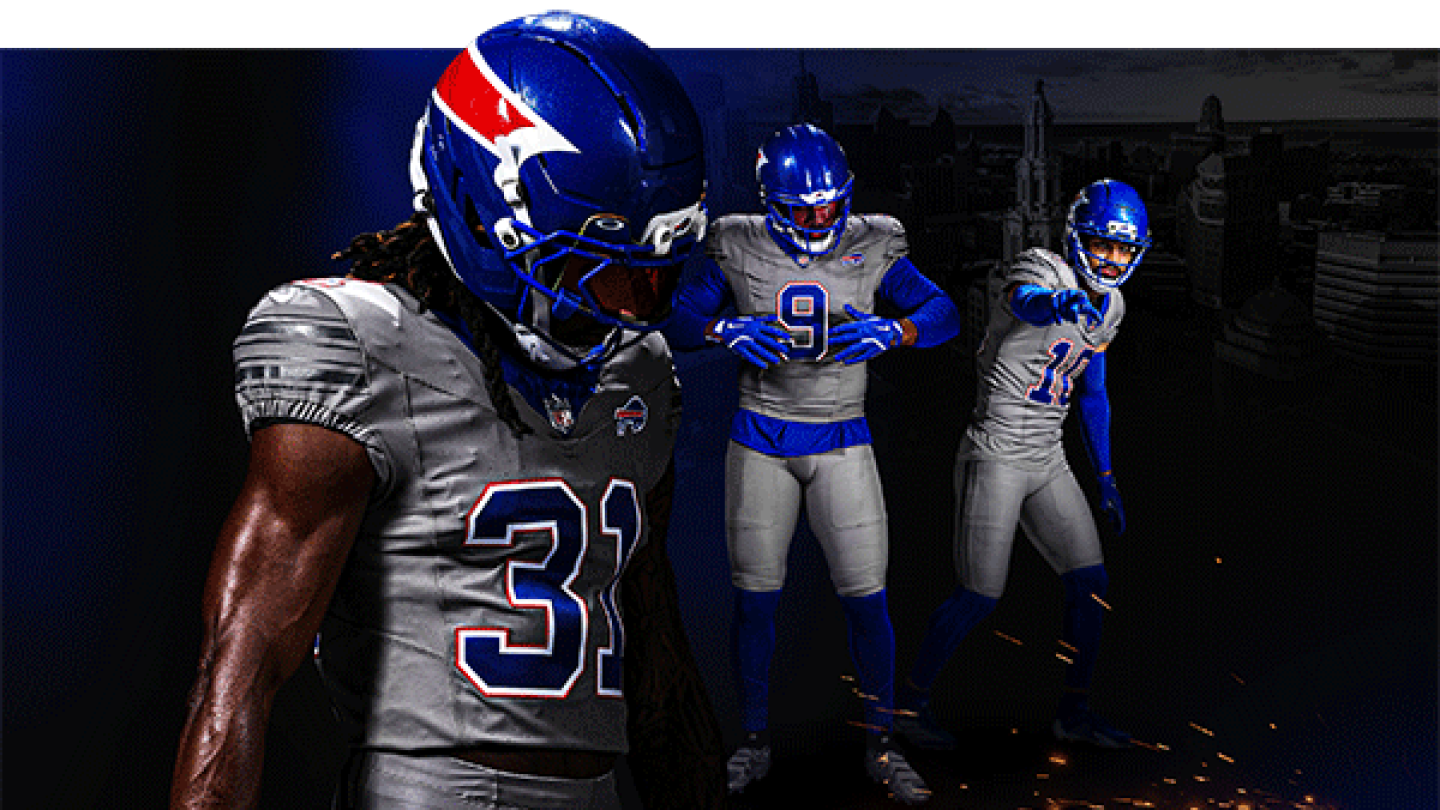
The Buffalo Bills have unveiled their new “Nickel City” alternate uniform, introducing a striking aesthetic shift as the franchise prepares for the inaugural season at the new Highmark Stadium. Featuring an all-gray jersey and pants combination anchored by a royal blue helmet designated as “The Charge,” the kit introduces a secondary color palette rooted in Western New York’s industrial legacy and civic history.
By anchoring this aesthetic shift to the opening of Highmark Stadium, the franchise aligns its visual identity with major infrastructure investment. This strategic release leverages a transition period in team history to drive fan engagement and optimize retail merchandise cycles.
NFL Brand Regulations and Design Framework
Developing an alternate uniform within the NFL requires adherence to strict league governance regarding team color palettes. Under regulations governing alternate Color Rush designations, clubs must utilize secondary colors already established within their official brand guidelines, preventing teams from introducing arbitrary hues.
Aaron La Porta, the Buffalo Bills’ Director of Design, noted that the Color Rush framework mandated the use of an existing secondary base shade. Gray represented the sole underutilized accent within the franchise’s official palette that had never been developed into a primary garment concept. Transforming this accent color into a full monochrome uniform allowed the design team to create a visual distinction from standard home and road attire while remaining within league mandates.
Industrial Heritage and Regional Iconography
The “Nickel City” concept draws directly from Western New York’s economic origins. The monochrome gray aesthetic reflects the steel mills, grain elevators, and rail yards that historically powered Buffalo’s economy. Additionally, the design serves as a tribute to the tradespeople constructing the new Highmark Stadium, embedding regional labor identity into the team’s commercial apparel line.
The uniform’s title also references the US Buffalo Nickel minted from 1913 to 1938, which featured an American bison on its reverse side. By tapping into regional numismatic history, the organization grounds its commercial product strategy in recognizable civic symbols.
Visual Architecture of ‘The Charge’ Helmet
The helmet—labeled “The Charge”—features a royal blue shell accented by the team’s signature red streak graphic. This high-contrast element creates an abrupt visual separation from the monochrome gray jersey and pants.
Crucially, the helmet departs from franchise tradition by omitting the complete buffalo silhouette that has historically anchored the team’s headwear. Replacing the full animal graphic with only the red charging element represents a notable shift in brand presentation. This decision has sparked debate among observers, who highlight the paradox of referencing the Buffalo Nickel—a coin famous for its detailed bison—while stripping the bison icon from the helmet design.
Market Mechanics and Brand Equity Balance
From a sports marketing perspective, alternate uniforms function as high-margin revenue drivers. Introducing an exclusive colorway establishes a distinct product tier that incentivizes current gear owners to make secondary purchases ahead of the stadium opening.
However, the release has drawn criticism regarding the ongoing “Nikefication” of professional sports apparel, where rapid iteration risks diluting core visual identity. Critics argue the simplified layout resembles custom video game options or spring league attire rather than traditional gridiron aesthetics. For an established franchise with strong legacy brand equity built on original AFL colors, frequent alternate launches require a precise balance between short-term merchandising yield and long-term brand integrity.